Our New Logo
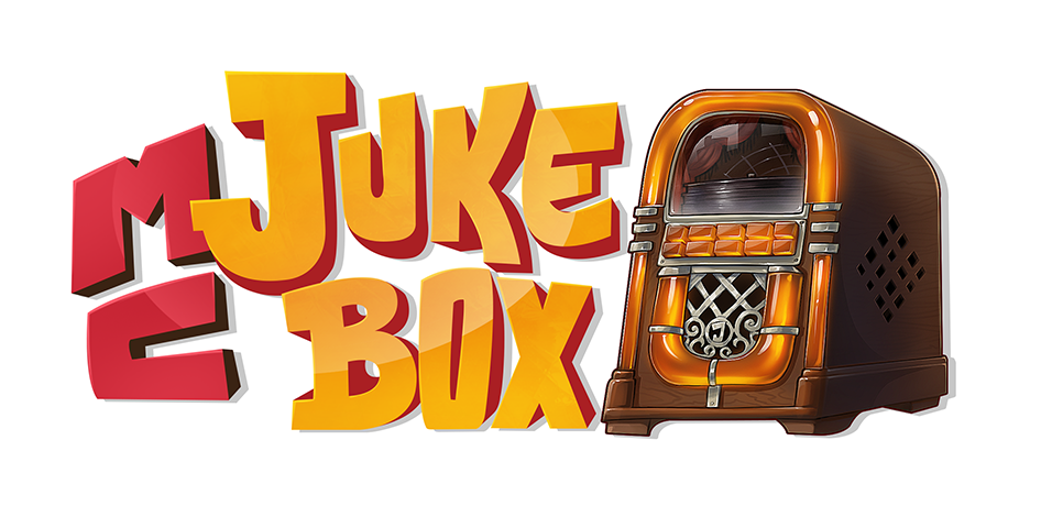
Chances are, when taking a look at our site you noticed the logo which I just launched. Before I say anymore, I think you'll agree with me that it looks pretty groovy! To make a long story short, it was created by Craftilldawn, a brilliant graphics design team with whom it was a pleasure to work with. Be sure to give their site a visit, but first, here's the story of how our logo came to be.
Like all good logos, I started wanting a brand identity that people could associate with the product. It had to link somewhat to our name, and my friend Lewis put together a quick draft which you can see below.  It certainly wasn't perfect, and I knew that there was a lot of work to be done, but it served well as the initial prototype and helped me to communicate with others about what I was looking for. My main concerns were that the logo needed to look more modern, have a bit more of a personality and should work better with the rectangular layout we'd be using on the site.
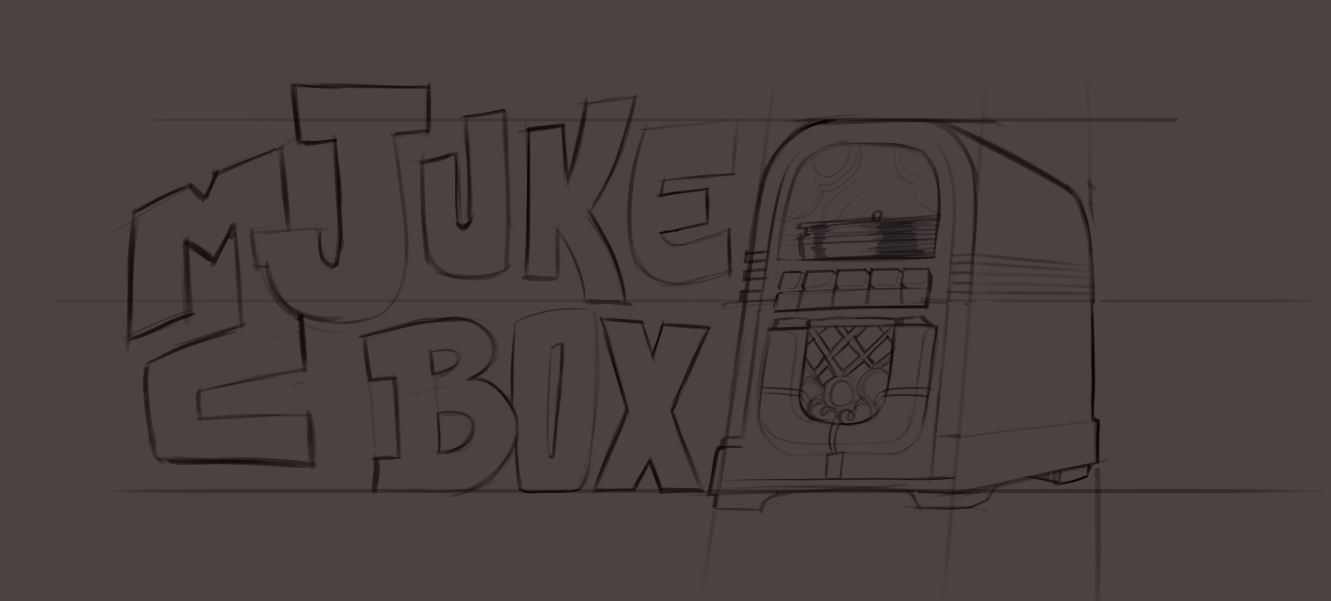
It was at this point that I made contact with Craftilldawn. While they generally only work on much bigger projects, they offered to give us a helping hand and quickly sent over the first draft for what they were thinking of. For an initial sketch, I was quite impressed.  From here on in, it was a case of letting their team work their magic! I wasn't a fan of how the two letters joined together, so we agreed to take this out of the final product and they got to work. Within a few days, I received the message I had been waiting for and our logo was complete.